

APPENDIX C
Presenting Statistical Data
Statistical data can be depicted in a frequency distribution table. This data can be prepared in a logical order, condensed and simplified, and essential details can be retained.
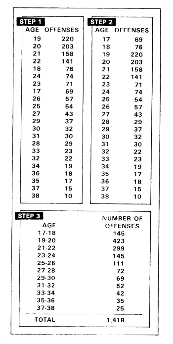
Three steps are required in construction of a frequency distribution table.
- Step 1. The collection of raw data. The graphic illustrates raw data on the number of offenses per month for different age classes from 17 to 38. Data arranged in this manner make it difficult to determine which age class has the highest total number of offenses for the year.
- Step 2. This step involves totaling the items in each class and arranging them in order of magnitude. Such an arrangement (whether ascending or descending) is called an array. This graphic shows an array with yearly total offenses for each age listed in descending order. The range of total offenses is from 220 to 10 with a concentration of offenses in the younger age classes and comparatively few offenses in the older age classes.
- Step 3. Finally, in preparing a frequency distribution table, classes are combined into class intervals or groups. In this graphic two-year class intervals have been used making it easier to see a large concentration. (The largest concentration is 423 or the 19-20 age interval.) Other data suitable for frequency distribution tables include--
- Accident frequencies.
- Accident fatalities or injuries.
- Offenses by categories; that is, assaults, robberies, and so forth.
Data taken from a frequency distribution table can then be depicted in a chart or graph. A vertical or horizontal bar chart may be used to depict the information. Or a circle graph or pie chart may be used. A pin map chart is another way to graphically present the data.
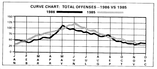
CURVE CHART
The curve or line chart is probably the most widely used form of graphic presentation. It is very simple to construct presentation. It is very simple to construct and is most effective when the emphasis is on movement, rather than amount. The curve chart is normally used for data covering a long period of time. It is also possible to compare two or more series on the same chart. The curve or line chart may be used to show trends in various enforcement activities, such as total AWOLs, vehicle registrations, offenses, apprehensions, and so forth.
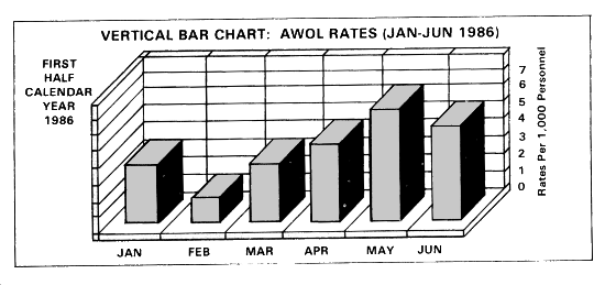
VERTICAL BAR CHART
Another chart frequently used to depict enforcement data is the vertical bar or column chart. This chart is also used to depict numerical values of a given item over a period of time. It may be used for months of the year, as shown, for days of the week, for hours of the day, or for all three. The chart is simple to construct and readily understood. The vertical bar chart is preferable to the curve chart when a sharper delineation of trend is to be shown.
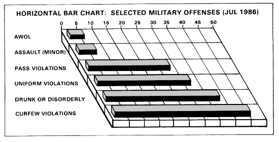
HORIZONTAL BAR CHART
The horizontal bar chart is the simplest form of graph. Its primary use is to compare different items as of a specified date. In MP work, the horizontal bar chart is used to break down offenses by units, traffic violations by specific violation over a given period and for a specified date, and similar categories.
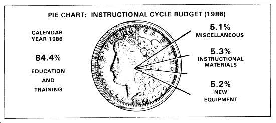
CIRCLE GRAPH OR PIE (SECTOR) CHART
The circle graph or pie (sector) chart compares various components with each other and with the whole. This chart serves to direct attention to extreme areas. The primary disadvantage of the pie chart is that where many segments are involved the chart will appear confusing. The small sections of the chart will be difficult to label in such a case. A bar chart is recommended when dealing with numerous components.
PIN MAP
The pin map is another way of graphically presenting data pertaining to frequency, type, and location of accidents or incidents. This chart is also considered to be an essential element of selective enforcement planning, A map of an area is mounted on a board capable of holding pins. Locations of accidents or incidents are indicated by pins stuck into the map at the location where the incidents or accidents occurred. Different types of accidents or incidents (that is, injury, fatality) may be depicted by different colored or marked pins. The pin map may be used as a yearly record and, if photographed, may be compared with succeeding years.
| Editor's Note: This graphic is not viewable in HTML format. Check "Download Document" at the top of this file for an alternate format or obtain a printed copy of the document. |
|
NEWSLETTER
|
| Join the GlobalSecurity.org mailing list |
|
|
|